
Dermalyse
Timeline
4 months (Jun - Oct, 2022)
Role
UX/UI Designer, UX Researcher
Tools
Figma, Miro, UsabilityHub
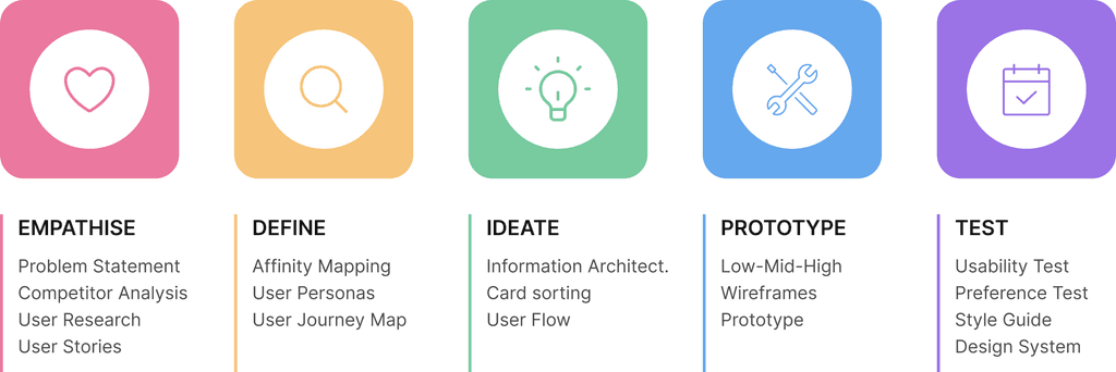
Introduction
Dermalyse is a dermatology triage app empowered with a medical AI-algorithm, allowing users to easily self-check their skin conditions by capturing photos with their smartphones. It provides instant results and recommendations, and connects users with local doctors and dermatologists. Users can also schedule appointments, track their skin conditions over time, and receive prescriptions through the app.
I would like to share the journey that lead to the creation of Dermalyse, an app designed to support people who care about their skin health, and need a way to get quick and reliable answers without the slowness of regular medical processes.
My role
This project was a part of my Careerfoundry’s UX Design course. The objective of the design brief was to develop a health-care responsive web-app. I decided to create a dermatology app, given the visual nature of skin-related issues and their compatibility with device integration. I applied the design thinking process to develop the product from concept to a fully interactive prototype.
Problem
People dealing with dermatological conditions face ongoing challenges that affect their self-esteem and induce stress, increased by lengthy waiting periods to consult with dermatologists. For the same reason, many people have never been screened for skin cancer, and by the time they decide to do so, it may already be too late.
While various dermatology apps exist on the market, employing AI systems or online dermatologists to analyse user-captured photos for diagnosis, these services often come at a cost and lack the crucial patient-doctor interaction.
Goal
The aim was to develop a solution that establishes trust, empowering users to proactively monitor their skin health and facilitate direct communication with their trusted doctors, enabling them to get advice in case of a serious condition and determine the necessary course of action.
To meet these objectives, the app should establish partnerships with public and private health systems, ensuring that users can benefit from their health insurance. In addition, the integration of a clinical dermatology AI would provide users with reliable information about their skin health.
Given the diverse range of users, it was essential to design a straightforward and user-friendly layout, prioritising ease of use for people with different backgrounds and technological expertise.
Competitive analysis
The first step was to assess how my app's competitors were designing for their users. After an intensive search I chose two of the main competitors offering different services (AI scanning vs. Online dermatologists), to identify underserved opportunities and to spot their strengths and weaknesses. Both apps worked in a similar way: users took a couple of photos of their skin condition and had to pay to get the results and recommendations.

Skinvision
FirstDerm
Analysis
Moles (skin cancer detection)
Wide variety of skin, hair, and nails conditions
Dermatology services
Clinically validated AI system, verified by dermatologists
Board certified dermatologists and AI System only for the web
Devices
Mobile app (iOS, Android) Website
Web app (IOS, Android)
Response time
Instantaneous
From 24 hours
Skin condition monitoring
Yes (body map & reminders)
No
Pricing
Single risk assessment (6€) Subscription (from 29.99€)
Depends on the response time (from €14.95 to €49.95)
Usability
UI design
View full study
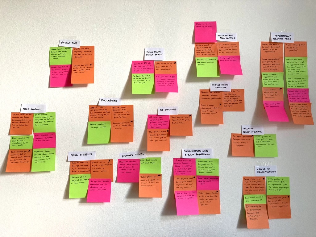
Learning about the audience
To better understand how people deal with dermatological problems and identify their needs, behaviours, and frustrations with common medical practices, I conducted interviews and surveys that helped me gather valuable insights from diverse perspectives. I also wanted to know if the participants had used any dermatological apps or if they were aware of the application of AI in the medical field.
I selected four participants for the interviews, including individuals with chronic diseases and those who sought occasional dermatologist visits, as the needs and routines vary in each case.
FINDING #1
Slow medical processes
Long waiting lists (1 to 4 months) for dermatologist appointments cause anxiety and stress among individuals seeking medical attention. To speed up the process many opt for private dermatologists with a high-cost associated.
INTERVIEW QUOTE
FINDING #2
Difference between Public health systems
Access to dermatologists depends on the public health system in each country. In some cases they must be referred through their GP and in others they can choose them directly.
INTERVIEW QUOTE
FINDING #3
Monitoring and treatment
People suffering from chronic diseases would like to track their lesions over time and receive prescriptions digitally without having to make an appointment in person.
INTERVIEW QUOTE
FINDING #4
No data transmission
When patients change doctors/dermatologists the medical records are not transferred and everything has to be explained again.
INTERVIEW QUOTE
FINDING #5
Lack of awareness of medical apps
None of the participants had ever used a dermatological app and did not even know they existed. They would use it if the result was backed by a doctor's opinion.
INTERVIEW QUOTE
What do my users need?
I organised the research findings into an affinity map, grouping data with similar themes and synthesising the information to generate concrete solutions.
Key features
After analysing the data, I could identify the most important features that the application should have. These ideas guided me in making informed decisions about the design of the project.
FEATURE #1
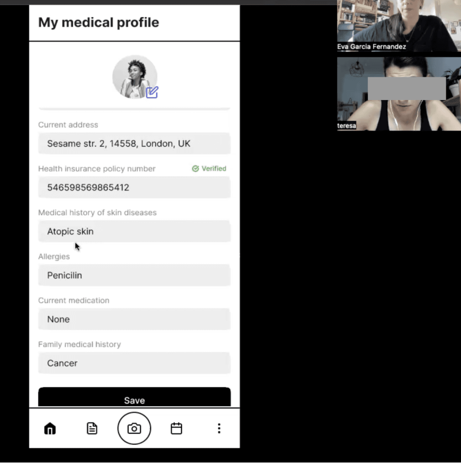
Medical profile
The implementation of a medical profile can streamline the exchange of information between patients and doctors, including details such as allergies, medications, diseases, etc.
FEATURE #2
Symptomatology questionnaire
Along with the AI scan analysis users can describe in detail their symptoms and other relevant information. This approach ensures that users receive more accurate and personalised results.
FEATURE #3
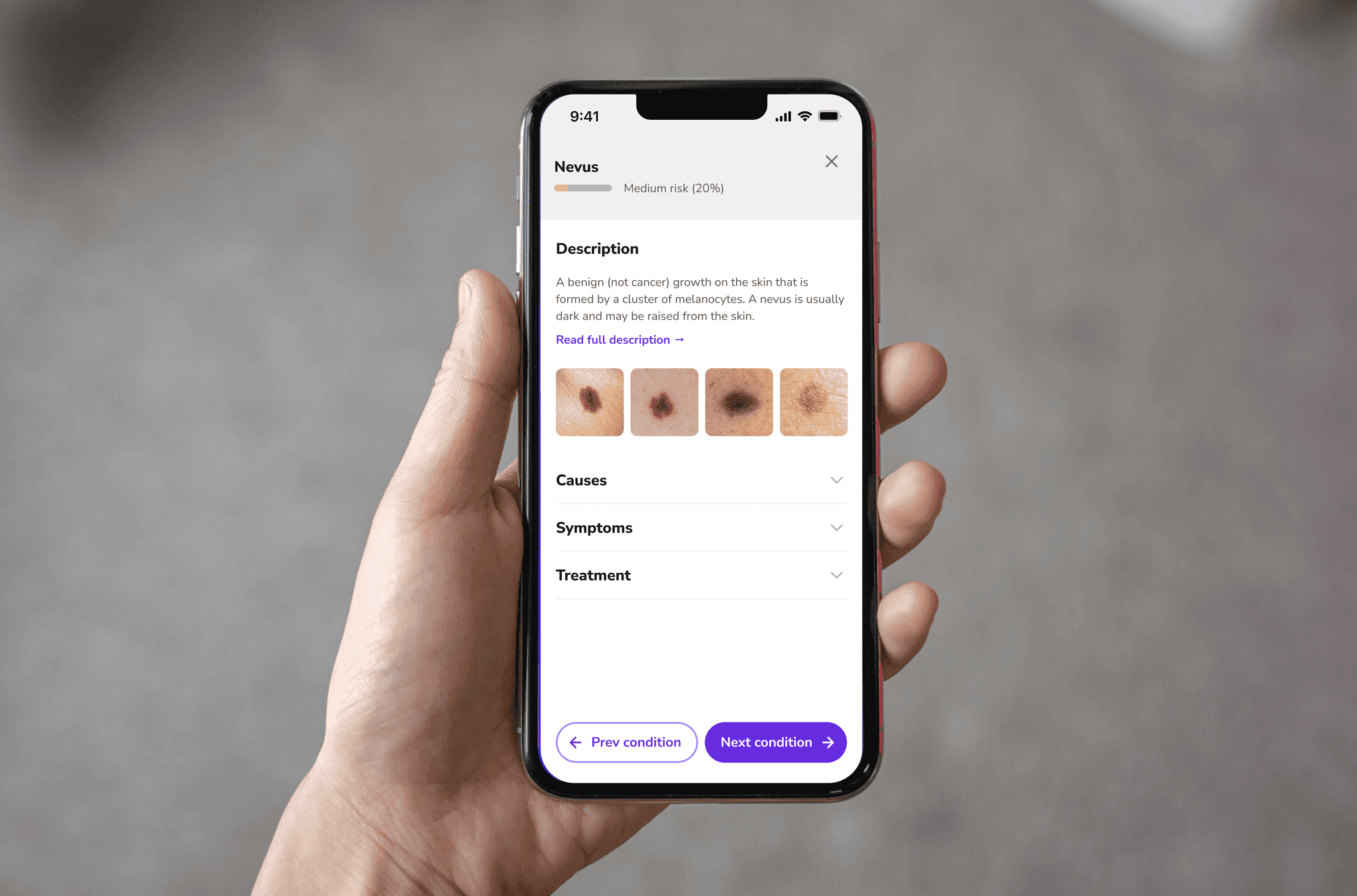
Results’ description
The results section offers an overview of the skin condition, including images, medical information, and a risk assessment categorised as low, medium, or high risk. Users also receive recommendations for the next steps to take, which may involve sharing the results with a doctor for further review.
FEATURE #4
Case files
A centralised repository for all case-related information, including photos, results, communications with the doctor, prescriptions, and appointments. The information is securely stored and easily accessible, facilitating efficient case management.
FEATURE #5
Tracker and body map
The body map feature allows users to pinpoint affected areas and monitor their skin condition over time, while setting reminders. Users can share pictures with their doctor, facilitating communication and personalised care.
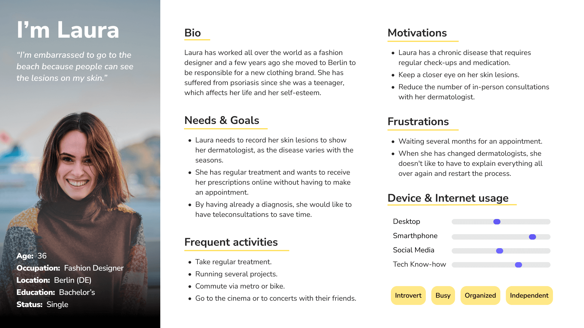
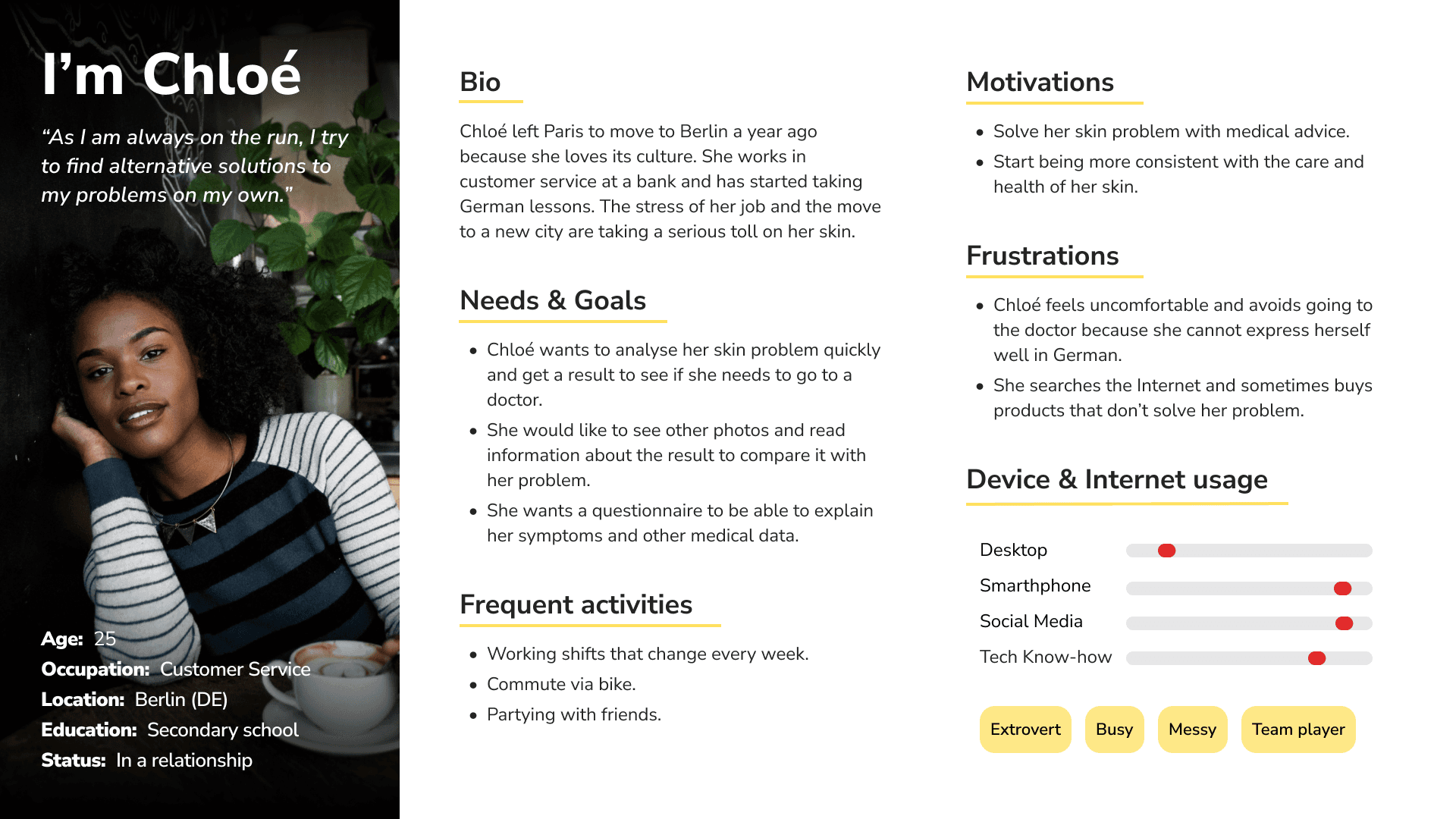
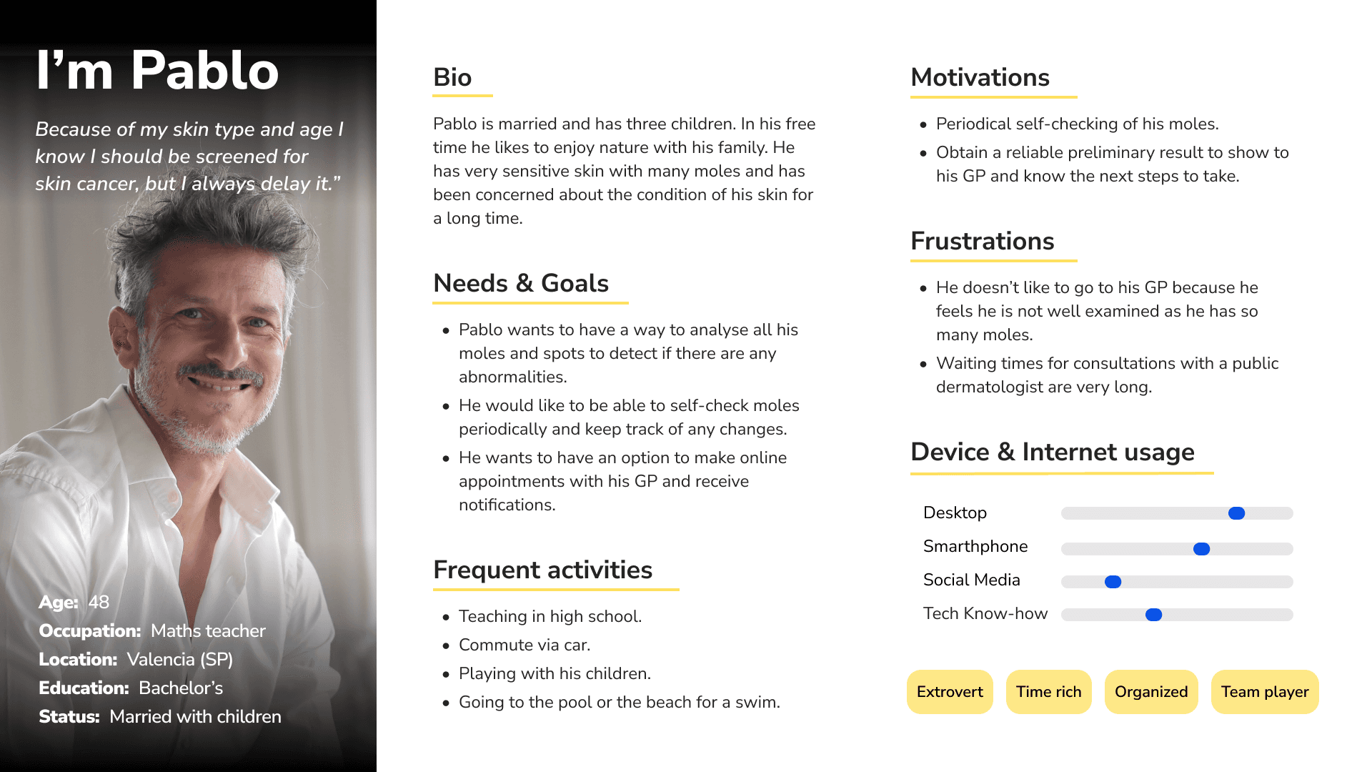
User Persona
Based on my findings, I created 3 user personas, a fictional representation of my potential users with different needs:
Laura, dealing with a chronic skin disease, requires frequent dermatologist visits for lesion monitoring and treatment.
Chloé, a busy young girl, seeks a trustworthy solution to asses her skin issues quickly and determine the need for medical attention.
Pablo, concerned about certain moles, desires a convenient means to scan them for anomalies and obtain preliminary results to guide his next steps.
User Journey Maps
To gain a deeper understanding of the user experience, I employed user journey maps, allowing me to visualise the step-by-step processes my User personas undertake to accomplish their goals. This technique provided valuable insights into user interactions, emotional experiences, pain points, and opportunities for improvement across the different phases of the journey.


Building the foundations
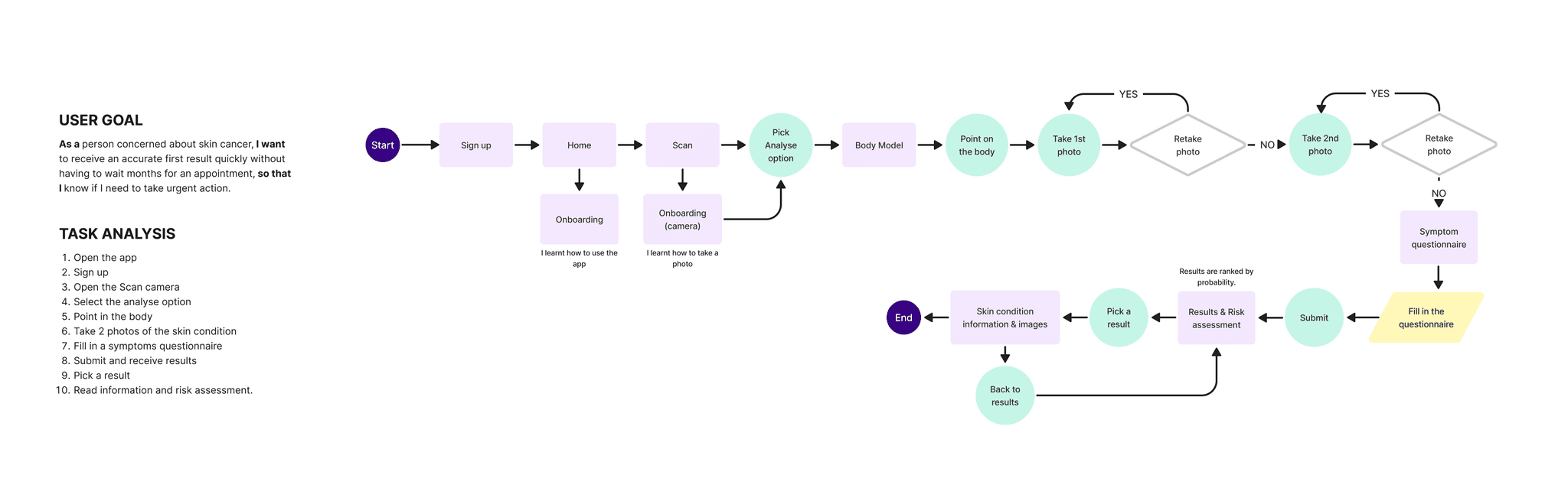
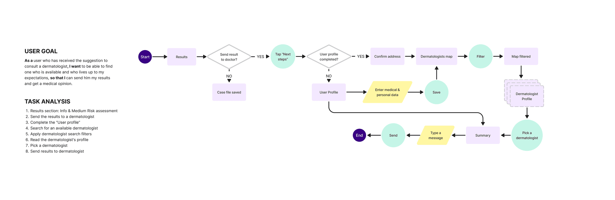
The insights gathered from user research enabled me to define the core features of the app, focusing on three key ways of providing support to my potential users. I crafted user flows that mapped out the path users would take and the essential screens required to meet their goals. My focus was on creating and intuitive process, keeping it straightforward and to the point.
Analyse a skin condition
Track a skin condition and share photos with dermatologist
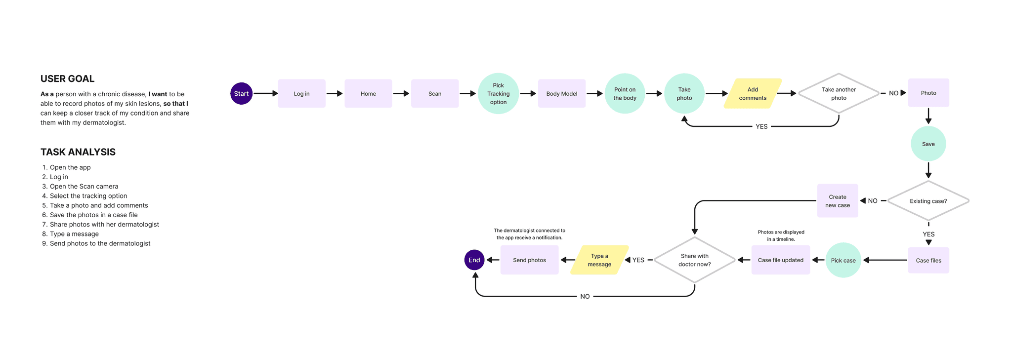
Find a dermatologist to send the results for review
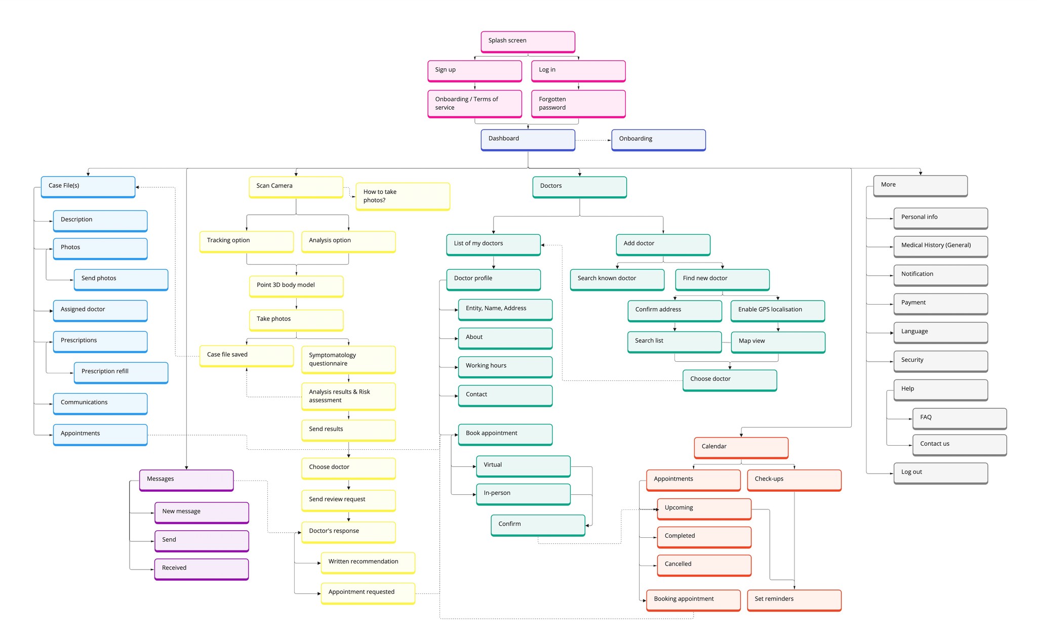
The next step was to structure the app’s content through a sitemap, mapping out the arrangement and connections between screens, establishing a clear hierarchy.
To refine the initial sitemap, I conducted a card sorting test with six participants using the OptimalSort tool. The aim of the study was to find out how users organise content into different categories that make the most sense to them.
As a result, I introduced a dedicated "Doctors" category based on user feedback, allowing users to access and manage their list of doctors (including their GP and dermatologist) independently, rather than only selecting a doctor after completing the scanning process.
App sitemap
Shaping the product
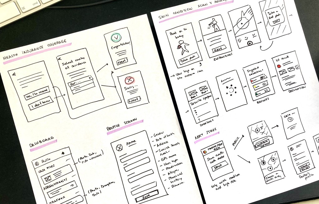
Sketches
I created quick sketches to get my initial ideas down on paper and see what the navigation would look like for Dermalyse's main flows.
As the goal of my project was to offer the service for free, a key challenge was to determine the user's health insurance status. I decided to ask for the user's country of residence before the registration process to tailor the availability and terms of service accordingly. Users also had the option to indicate alternative private health insurance.
Another consideration was determining the scenarios in which users should send their results to doctors. To prioritise urgent cases and optimise the doctor's workflow, the severity and probability of results guided the decision. Only medium and high-risk cases prompted users to share their results for further evaluation.
Wireframes & Low-fid prototype
After multiple iterations, it was time to raise the level of the wireframes to create an interactive prototype specifically tailored to the mobile user experience.
Some screens from the low-fidelity prototype
Testing Dermalyse
To validate the design and assess the ease and intuitiveness of the navigation, I conducted remote usability tests with six participants. Each session began with a scripted introduction explaining the purpose of the study, followed by preliminary instructions. Participants were then asked to complete a series of scenario-based tasks to evaluate the core features of the app.
Imagine you've discovered a mole that appears suspicious and you want to determine if it poses any risks. A friend told you about a new dermatological app and you want to try it out.
Go through the app’s onboarding and create an account.
Scan the affected area and complete the questionnaire with your symptoms.
Find a doctor within the app and proceed with payment to have your results reviewed.
Usability testing findings
During the sessions, I observed users as they interacted with the app, paying especial attention to their feelings, thoughts, and body language. I also tracked their task completion success rate and identified any errors they encountered.
I categorised the collected data into an affinity map and organised it using a Rainbow spreadsheet for better visualise patterns and trends.
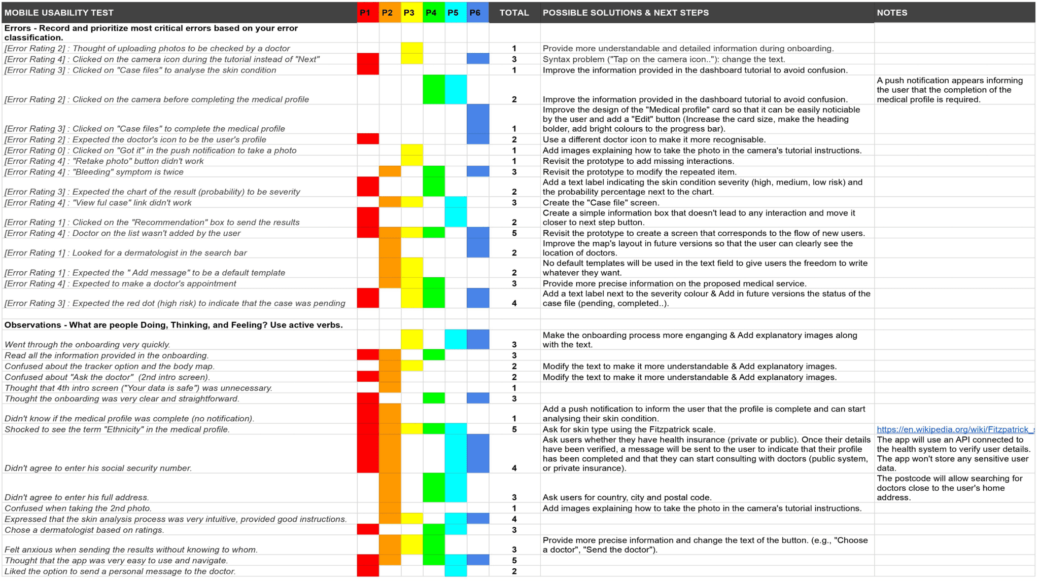
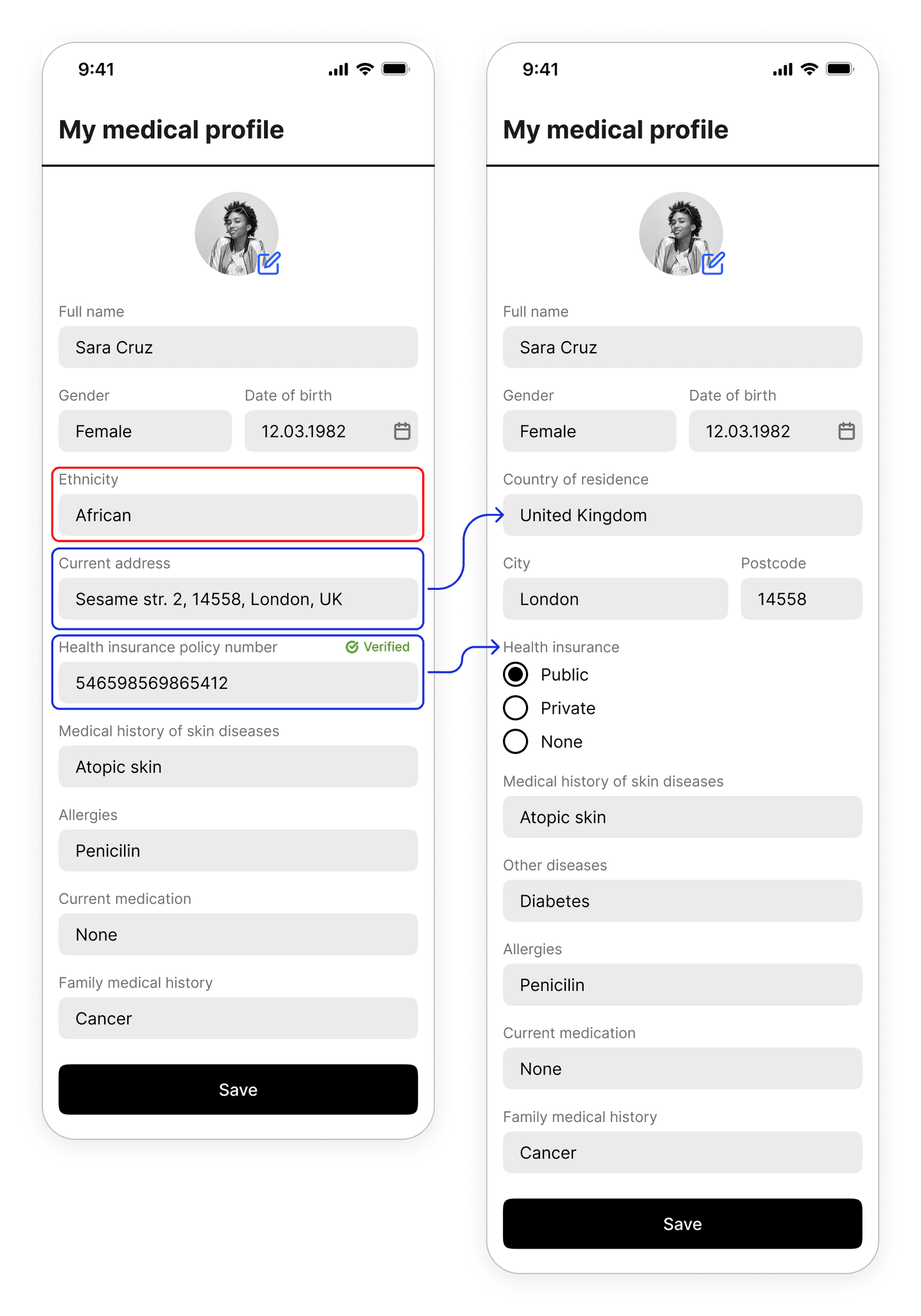
Issue #1
After onboarding, users had to complete their medical profile with health and personal information. Most participants didn't feel comfortable entering sensitive data such as ethnicity, social security number or full address.
“If the app asks me for sensitive information after signing up, I will not use it.”
USABILITY TESTING QUOTE
Solution
AI algorithm would analyse user's photos to determine skin type, eliminating the intrusive term "ethnicity” from the medical profile.
For health insurer validation, the integration of an API would connect to public or private health systems using the user’s full name, date of birth, and city of residence instead of insurance policy numbers.
Issue #2
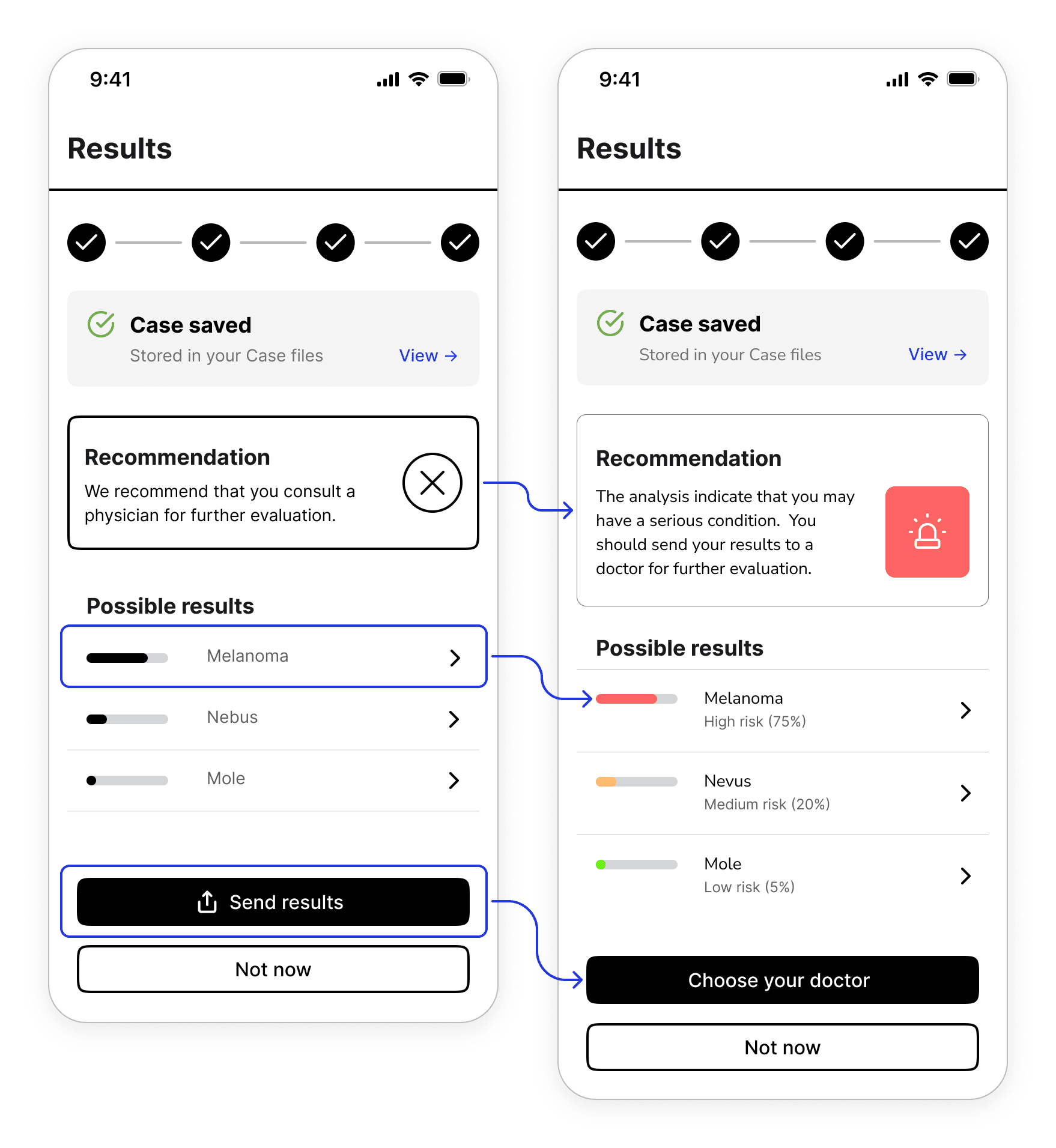
The results screen presented several problems that caused confusion and anxiety among participants as they were unsure of the next steps to take. Some misinterpreted the graph, confusing the severity of the skin condition with its likelihood, while most participants were unclear to whom the results would be sent.
“Hmm, I don't know who my results will be sent to, is it a doctor working for the application?”
USABILITY TESTING QUOTE
Solution
CTA copy was modified to clearly indicate the actions to be taken by the user: "Choose your doctor" instead of "Send results".
The severity of the skin condition (high, medium, low risk) and the percentage probability were added next to the graph.
Some participants clicked on the recommendation box to submit the results. The design and copy were changed to provide clearer information.
Issue #3
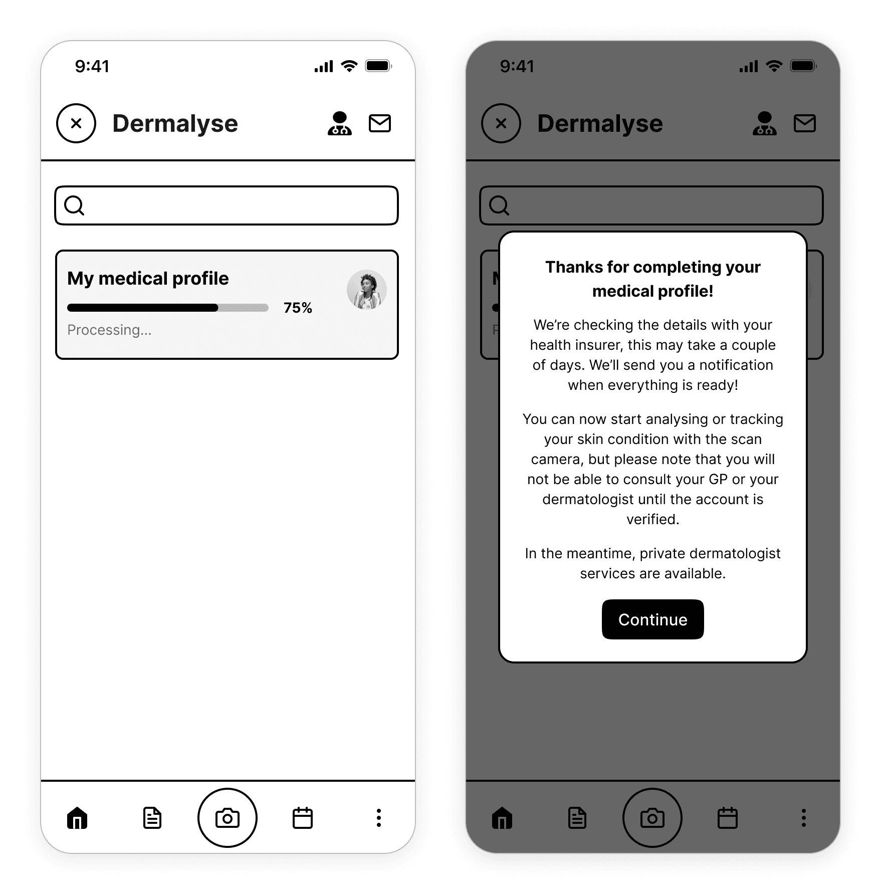
The lack of prior explanations led to the majority of participants not understanding that the app would connect with their health insurance to access their trusted doctor.
Solution
Once the medical profile is completed, a message notifies users that they cannot consult with the insurer's doctor until the account is verified. Nevertheless, they can still analyse their skin condition and seek advice from private dermatologists in the meantime.
A progress bar was added to indicate that the connexion with the health provider is being processed.
Refining the design
Dermalyse, as a medical service, focuses on trust, providing a safe environment for its users.
To evoke this feeling, I used white as the predominant colour to create a clean, minimalist interface. Purple was selected as the primary colour to draw attention to key elements like CTAs, links, and other important information, ensuring a high-contrast design. I incorporated delightful illustrations and animations to create a calming and pleasant experience, alleviating the seriousness of the application, especially for users who may receive unfavourable results.
Design system
I began by creating a style guide, which I used as a starting point to define the design system of Dermalyse. This allowed me to set clear rules and standards for maintaining design consistency across various platforms and devices.

Responsive design
I prioritised mobile-first design as the analysis of skin conditions requires the smartphone camera. Later, I extended the design to main desktop screens, using grids to ensure seamless adaptation to larger devices.
Final design
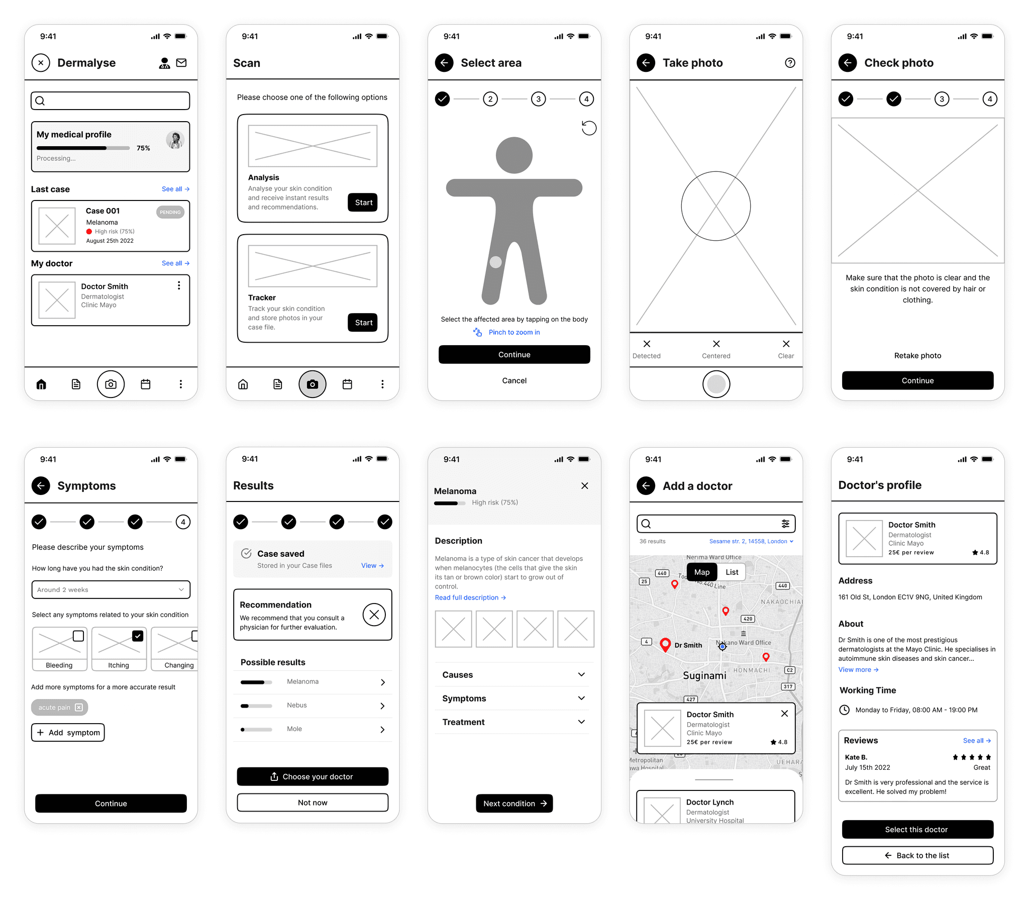
Here’s a detailed walkthrough of the final version, where I integrated new features to complete existing users’ flows.
Onboarding
Dermalyse onboarding is simple and straightforward, offering a clear introduction to its main services. After sign-up, a helpful walkthrough guides users through the app's features in a simple way.
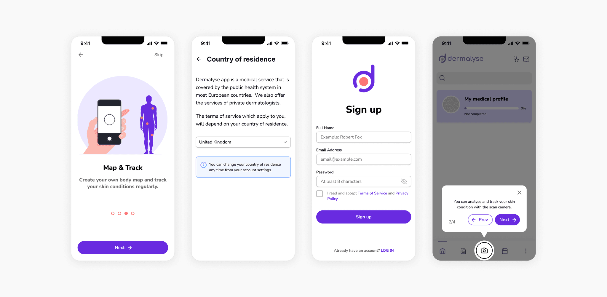
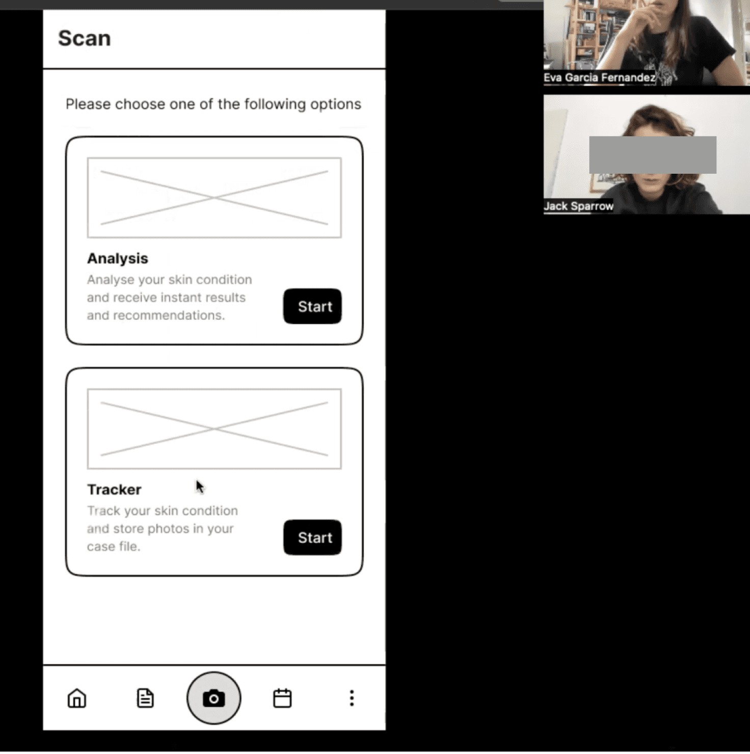
Skin condition analysis
Skin condition scanning takes only 4 simple steps. After completing the process, users receive three results ranked by risk and probability. For high and medium-risk cases, it's recommended to send the results to a doctor for further evaluation.

Add a doctor and send results
Users can easily search and add their trusted doctor (GP and/or dermatologist) or find new ones using the map feature. For private doctors, a simple in-app payment method has been integrated. The selected doctor receive a summary of the patient's medical data, photos, and results for review.
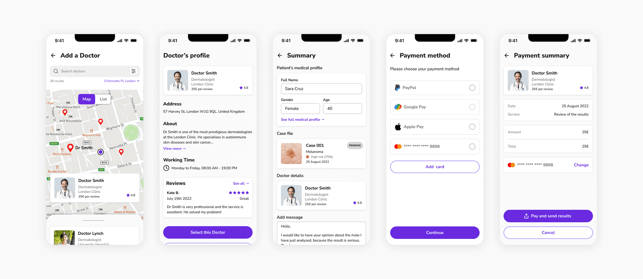
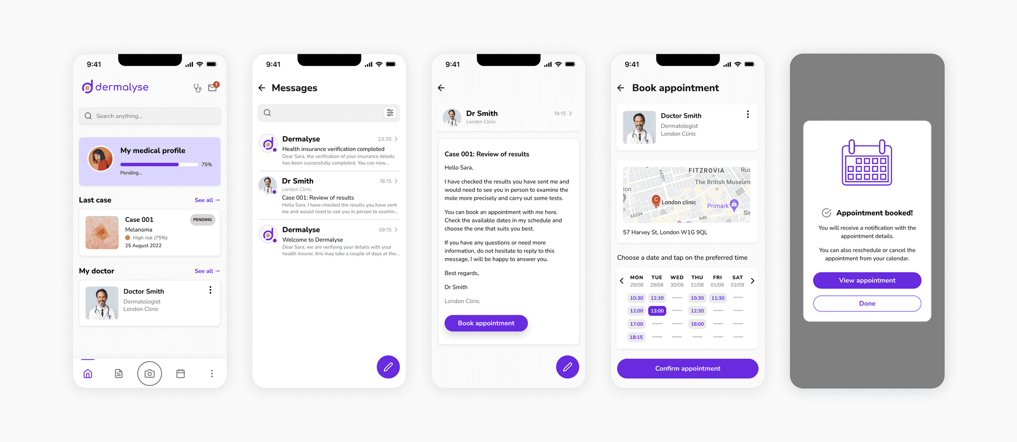
Communication with doctors
Users are notified of the doctor's recommendations, which may include an in-person consultation. To streamline the process, an integrated booking system allows users to quickly schedule appointments through the app.
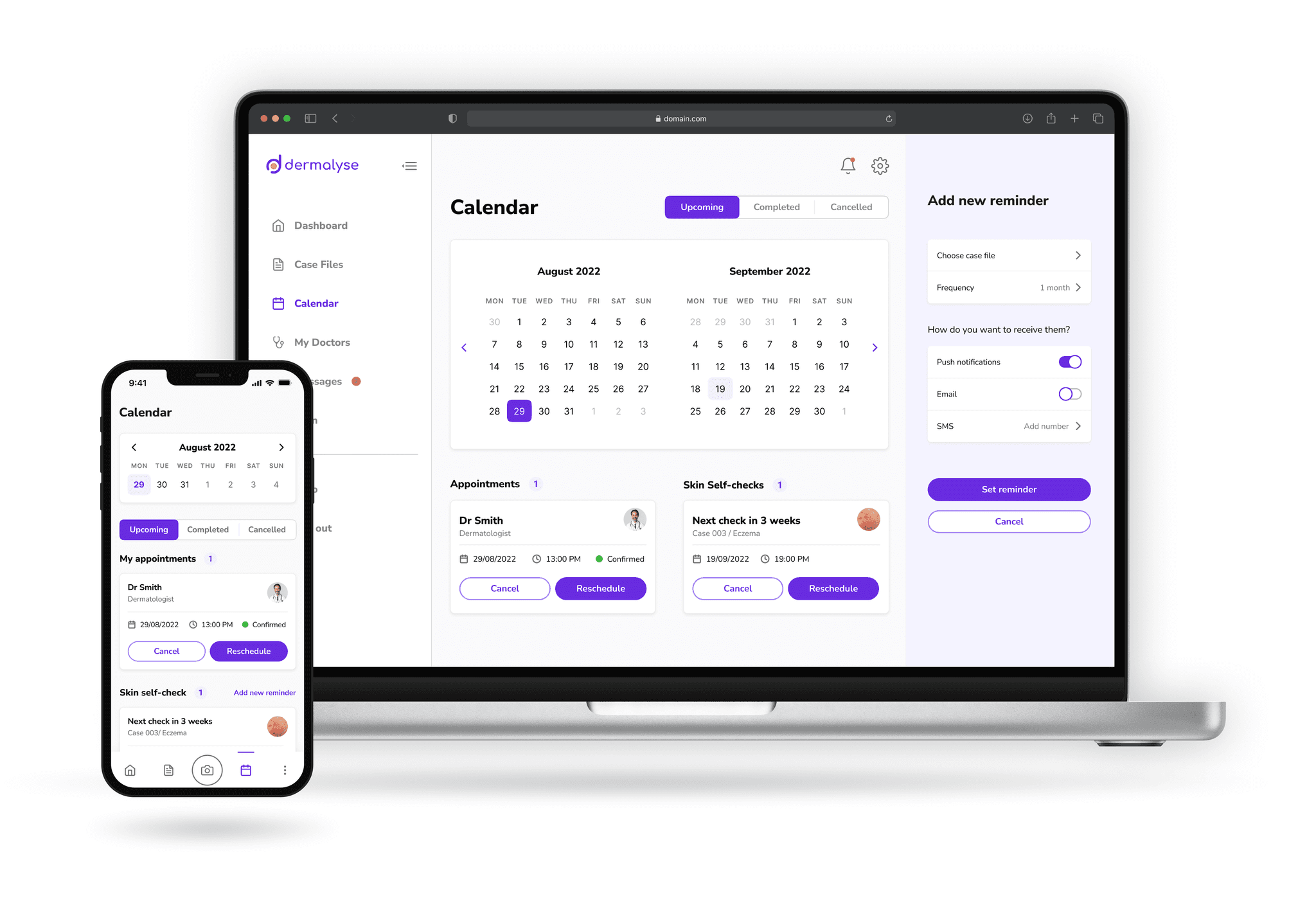
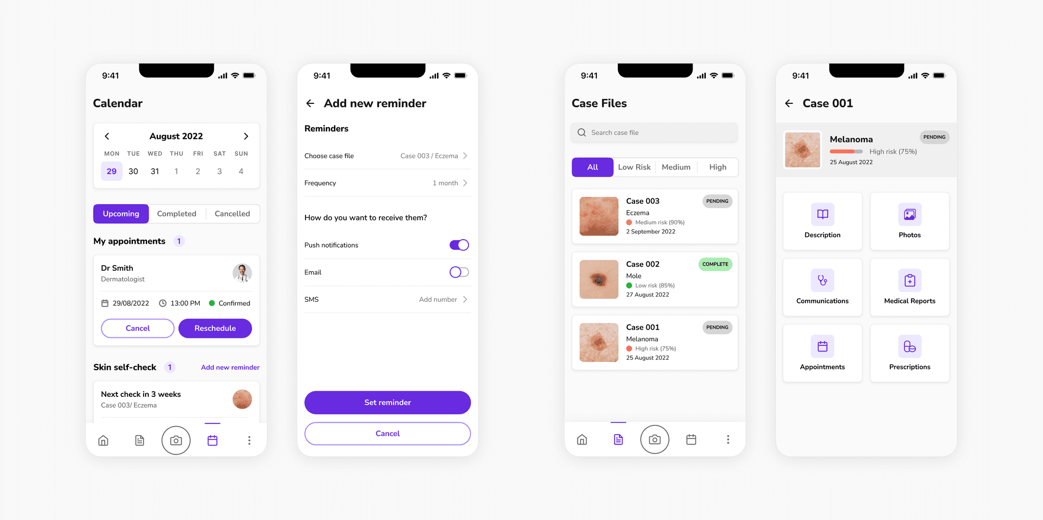
Case files & Calendar
Users have access to all their case files with easy filtering options based on risk levels and detailed information for each case (skin condition description, photos, communication with doctor, medical reports, appointments, and prescriptions).
The calendar feature enables users to quickly find their upcoming appointments and scheduled skin self-checks. In addition, they can set reminders for specific cases and choose the frequency of self-checks according to their preferences.
Try it out yourself!
What I learned
Dermalyse was a project that evolved gradually as I progressed through my UX designer training. I delved into various UX research methodologies and applied them at every stage of the design process, from conception to the final product. Embracing a user-centric approach was an exciting experience, and taught me to be open to new ideas and to continuously iterate to meet user needs effectively. The journey was not without challenges, but it provided invaluable lessons that have shaped me as a UX designer.
Adopting an open mindset
I learned the importance of letting go of preconceived ideas and assumptions about a given topic during the design process. By conducting interviews and usability tests, I gained insight into diverse perspectives and empathised with the users' needs. Their feedback, expressed needs, and experiences played a significant role in shaping and refining the initial concept of my project, ensuring it evolved into a truly user-driven product.
One step at a time
I tended to solve all design challenges simultaneously, which was overwhelming, but I soon learned to tackle each problem one by one. Breaking down complex problems into smaller, manageable tasks helped me maintain focus and achieve significant progress throughout the design process.
Being creative when you can't find resources
Finding dermatology-specific illustrations proved to be a challenge, as there was limited variety and most of them were paid. I had to create my own by reusing parts of medical illustrations and designing new elements using Figma.
Creating a style guide earlier in the design process
The late adoption of a style guide with colours, typography, reusable components and other UI elements slowed down the design iteration process. I should have taken this into account when designing the high-density wireframes, to be more efficient and ensure greater consistency across all screens of the application.
Next steps
In the future, I would like to develop the remaining features like case files, digital prescriptions, and a the tracker option, so Dermalyse becomes a one-stop solution for all users' skin health needs. As this was my first project, my primary focus was on crafting a seamless user experience. As I continue to grow as a designer, I aim to enhance the app's interface design, making it visually appealing and intuitive for users of all backgrounds and abilities. Accessibility is a core value, and I want to ensure that everyone can benefit from the app's services without any barriers.


The end result is a user-friendly electric bicycle that makes it easy for riders to enjoy the benefits of e-bikes without feeling overwhelmed by technology. With VoltBike, riding smarter has never been easier!